Hello there again! We’re back with another episode of The Logo Stories. This time, we wanted to talk about another tech brand which we love, and do have some significance impact with the brand we talked about last week.
If you missed the last post, check it out now: https://thelogopatrol.wordpress.com/2015/02/05/the-logo-stories-episode-1-microsoft/
So, getting back to this week’s episode of, The Logo Stories, Apple Inc.
Every big company you see today was a dream by some person. Simple beginning. So was Apple. Before getting to how the logo came into place, the name itself has a story behind it. The name “Apple” was given by one of the most iconic figures of our era, Steve Jobs. When he and Steve Wozniak came to the point of creating this new company of theirs, Steve came up with the name, “Apple”. Steve, as in Steve Jobs did. Two Steves at once. Yeesh.
And you know what Wozniak said? He said, “It’s a computer company, not a fruit store.” Oh how wrong he was. If only he knew how iconic this simple name is going to be.
So, the name “Apple” was set. Then came the branding and the logo. The 1st logo of Apple came out to play in 1976 by it’s 3rd co-founder, Ronald Wayne. (No, not related to Batman.) The 1st Apple logo featured a complex design for any of the tech companies around. It has Sir Isaac Newton sitting under an Apple tree, where he made his first steps in discovering the theory of gravity.
![]()
It also had this line, along the borders stating “Newton… A mind forever voyaging through strange seas of thought… alone“. Don’t think many of you guys have seen this logo of Apple, have you? Pretty classic styling.
Then came the Rainbow Logo. After 1976, Steve Jobs wanted a new face for the company. So with the aid of Rob Janoff, he managed to create something special. Little did they know, that they crated something that defined a company, and a lifestyle for the next 20 years. This logo became the most iconic, loved and hated logo in the corporate world.
![]()
This logo had many stories swarming around it. Majorly about the fact that there’s a part bitten off on the apple in the logo, and why was it like that. One of the major legends about this was inspired by the dead of Alan Turing, mathematician and a computer scientist, who committed suicide by eating a cyanide-laced apple in 1954. (This guy literally did a “Snow-White”.)
Later, the creator of the logo, Rob Janoff himself explained the “Bite” in the logo and his take on the Alan Turing story was, “What a wonderful urban legend.“. According to Janoff, the bite was to imply that it was an Apple, not a Cherry. Come to think of it, the logo in full would actually look like a Cherry.
The bite also had a impact with the word “Byte”, a unit of digital information which was another theory rounded up by the computer enthusiasts.
The rainbow colour logo implied the “Think Different(ly).“, message by Steve Jobs himself. “He wanted the green on the top because there was a leaf there” explains Janoff.
Former Apple executive Jean-Louis Gassee, said, “One of the deep mysteries to me is our logo, the symbol of lust and knowledge, bitten into, all crossed with the colours of the rainbow in the wrong order. You couldn’t dream of a more appropriate logo: lust, knowledge, hope and anarchy.” So Apple delivered. Lust. Hope. Anarchy.
This rainbow logo was active for 22 years, And it defined a whole era of computing and innovation.
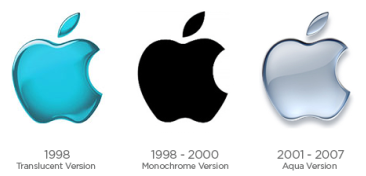
In 1998, Apple revamped their loved logo to match their new products, and hey, it was the 90’s!
![]()
This monochrome logo was due to their new line of Mac computers made with metal casings, and the rainbow colours did not really agree with the shiny metal outfits of their new products. This logo was embedded in Mac and the Mac Power Book G3.
This logo actually have 3 variations. With the era, you’ll understand why.
These iconic logos and the Apple name did hit some huge bumps on the road. Especially the one with Apple Corps Ltd., which was a media company started by none other than “The Beatles”. Since both companies had started off in 1976, they had a quite some issues when it came to branding. After years of lawsuits, in 2007 Apple had to to pay and settle with Apple Corps.
Why go through all this hassle? In 1981, Steve Jobs was asked why? Why Apple? His answer was “I like apples and love to eat them. But the main idea behind the apple was to bring simplicity to the people, in the most sophisticated way and that was it, nothing else.”
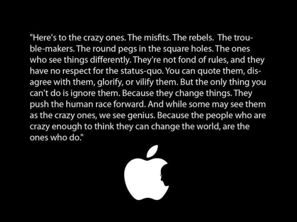
Steve Jobs left this world. He left this magnificent quote to be remembered alongside his name, forever. Apple really does have that attitude, charisma, the difference in them. Their logo, name, the trademark was the just screaming it out to the world.
Right now in 2015, Apple use a different variation of their logo introduced in 1998. Haven’t changed much but it does suit the time, and the line of products.
![]()
Apple is the hallmark of attitude, perfection and some ridiculous strength. This huge cooperation was a simple idea of some friends. It came a long way. A long way.
Apple managed to revolutionize the computers. The handheld devices. They created needs for stuff, we didn’t even wanted (iPad, who needed one before it was there?). Apple really is the hallmark of greatness. Hate it or love it, you know you have to respect it. Over the years, with what they have done, they deserve it.
If you have an idea, pursue it. Who knows, maybe you’re ought to be the next Steve Jobs.
Image Credits: Apple Inc. | Tribune.com

good work man , loved the article
LikeLike
Thank you Kaveen. 🙂
LikeLike